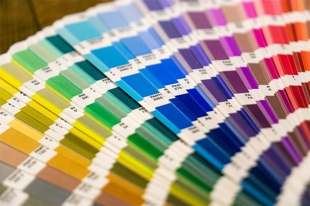
The Role of Pantone Colors in Packaging Design
Explore how Pantone colors elevate packaging design through brand consistency, visual impact, emotional connections, and sustainable options.
Why Pantone Colors Are Essential in Packaging
Pantone colors are the backbone of effective packaging design. They provide precise, reliable color standards that allow brands to create visually striking, emotionally resonant, and sustainable packaging solutions. Let’s explore their key benefits.
1. Brand Consistency in Packaging
With Pantone colors, brands can maintain uniformity across packaging materials, ensuring that their visual identity is recognizable on every product. This consistency builds trust and helps consumers easily identify their favorite products.
2. Visual Impact and Shelf Appeal
Pantone’s vast color palette enables designers to create striking packaging that captures attention. Bright neons, metallics, and soft pastels all serve to differentiate products in a competitive marketplace.
3. Emotional Connection Through Color Psychology
Pantone colors allow brands to evoke emotions through carefully chosen shades. From calming blues to energetic reds, the right colors enhance consumer experience and deepen emotional connections.
4. Reliable Quality Control
The Pantone Matching System (PMS) ensures precise color replication across different packaging materials. This level of reliability protects brand integrity and builds consumer trust.
5. Sustainability in Packaging
Pantone now offers eco-friendly inks and materials, enabling brands to align their packaging designs with sustainability goals and appeal to environmentally conscious consumers.
In the competitive packaging industry, Pantone colors are a vital tool for delivering high-quality, impactful designs. By leveraging their precision and versatility, brands can create packaging that not only stands out but also resonates with their audience.


